Celerette Branding & Packaging
Category: Fresh Food Branding & Packaging
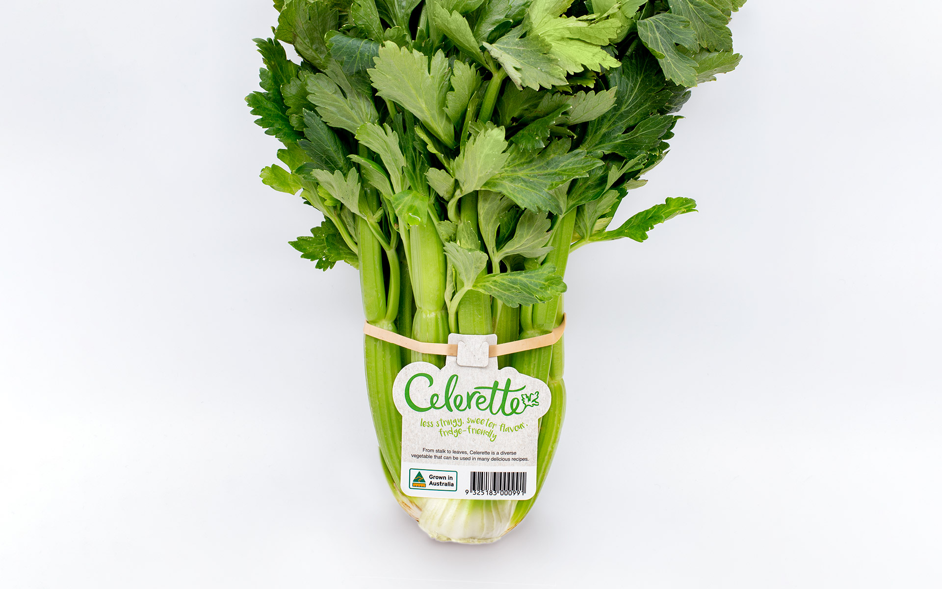
HS Fresh Food launched a new variant of “mini” celery that is sweeter, less stringy, and more fridge-friendly than regular celery. The supplier wanted the product to make a strong first impression, reflecting its unique qualities and appealing to the target market.
Challenge: Creating a Memorable Brand and Functional Packaging
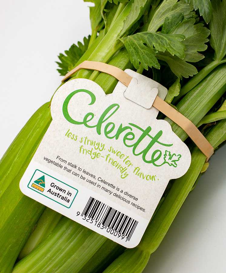
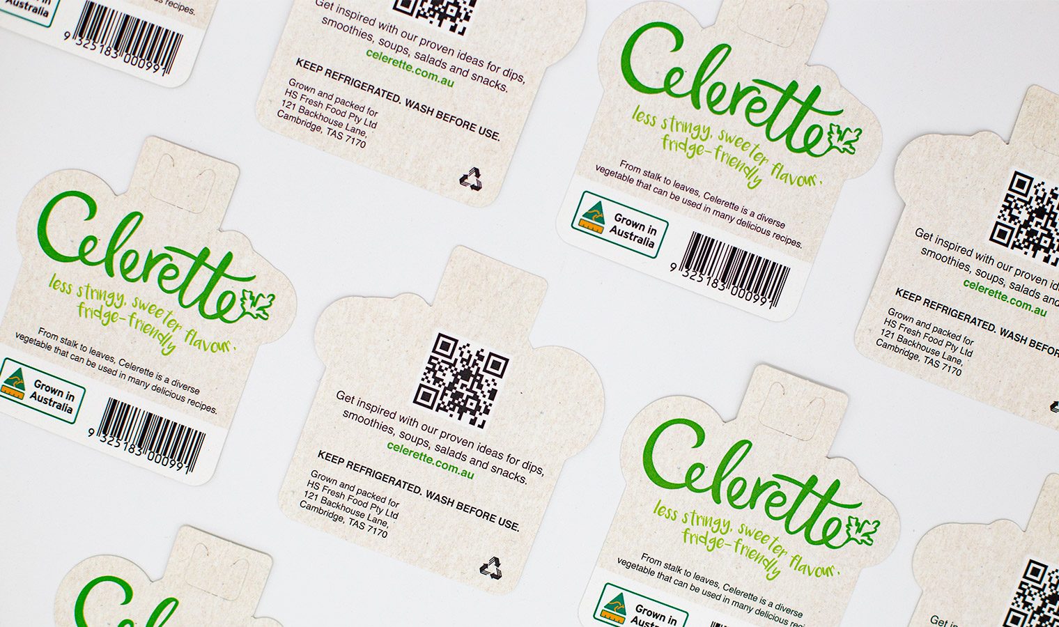
The product needed a name and visual identity that conveyed its fun, cheeky personality while highlighting its freshness and natural appeal. Additionally, the packaging had to be practical for hand application on the farm, resistant to water and dirt, and allow consumers to easily access product information without damaging the label.
Solution: Celerette – Branding with Personality and Practicality
We developed the name Celerette, reflecting the smaller, sweeter, and more charming celery variant. The branding features a custom illustration and script font on a natural textured background to convey freshness and approachability. Packaging was designed as a custom die-cut polypropylene card attached to an elastic band, with a clever lock-in slot for easy access to product information. The shape highlights the brand without adding cost, delivering a practical, durable, and visually appealing solution that elevates the product on shelf.
Celerette’s playful branding and practical, die-cut packaging make this sweet, mini celery instantly appealing and easy to use for both farmers and consumers.
Emanuel and his team know how to ask the questions that lead to a brand with the USP built in, a brand with the power to transcend private labels and still be on the shelf in five years time.”
Do you have a product that needs to jump off the shelf?
Do you have a product that needs shelf impact?
Would you like to work with specialist packaging designers who understand strategy, process, retail and shelf impact? We’d love to talk about how we can help and show you relevant examples.