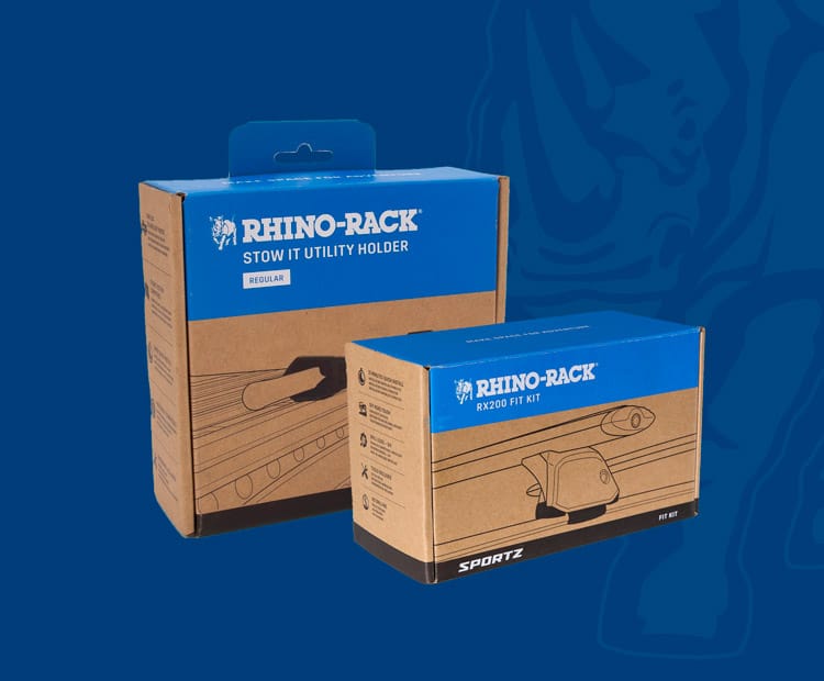
Sustainable Packaging Design for Rhino-Rack
Challenge: Balancing sustainability with brand identity
Solution: An eco-conscious look and feel while ensuring the packaging remained functional, informative, and instantly recognisable to customers. >>
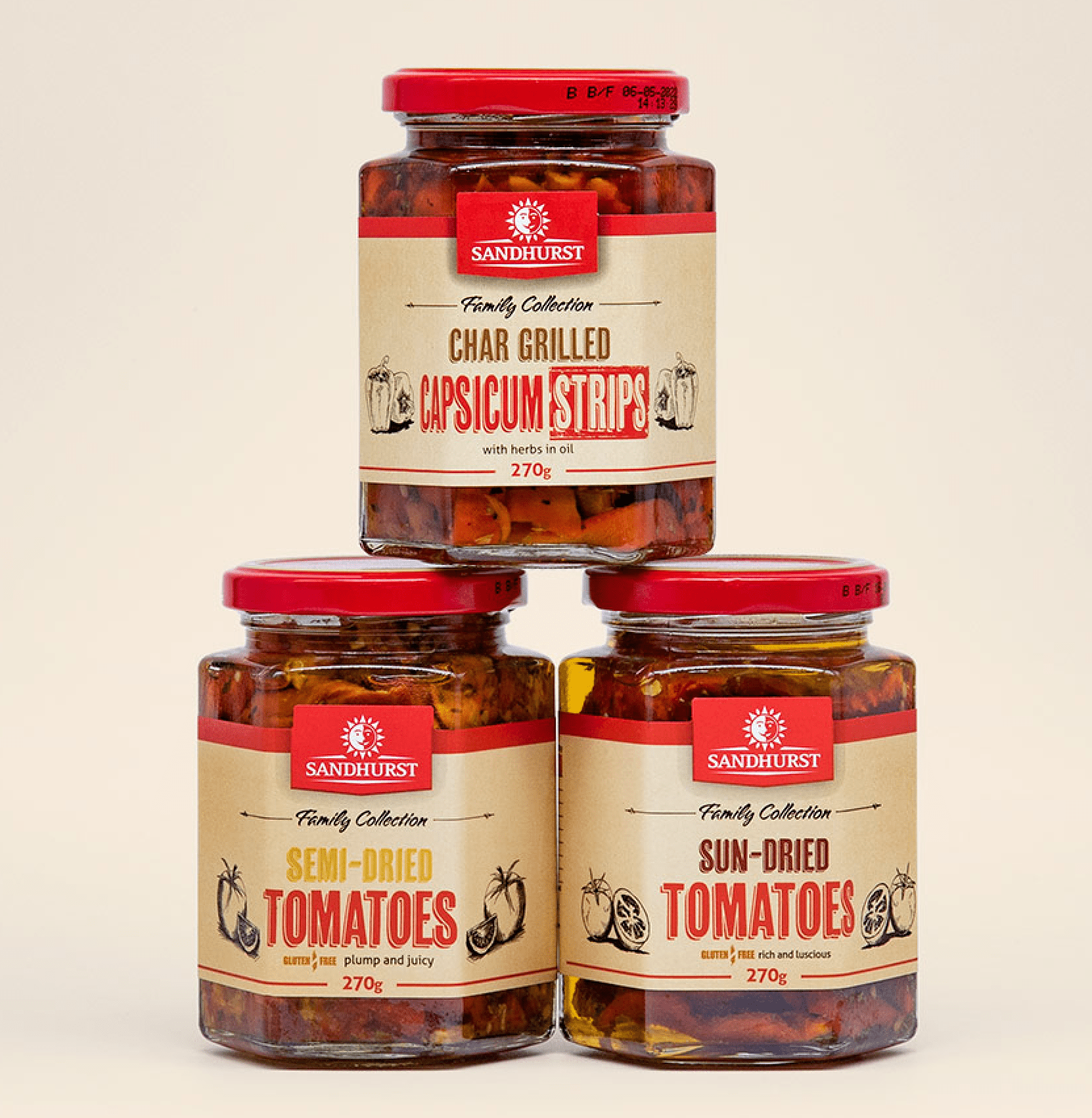
Retail Packaging and New Branding for Sandhurst
Challenge: Packaging to maximise return on advertising

Papa Macros Ready-Made Meals Packaging
Challenge: To differentiate the different types of ready-made meals
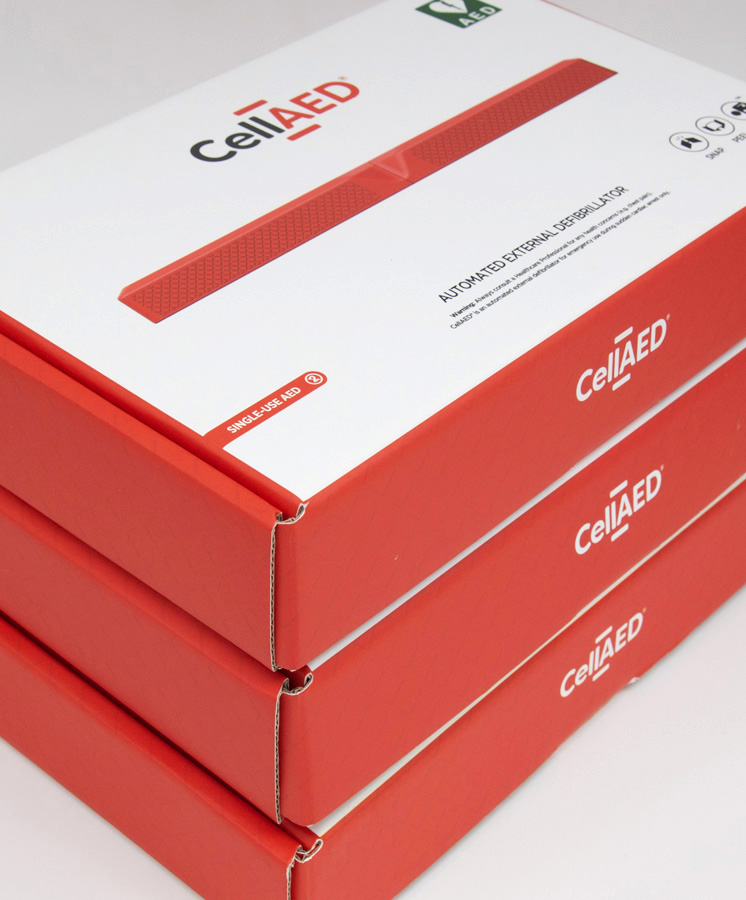
CellAed Medical Equipment Packaging
Challenge: A robust packaging format for shipping.
Solution: Innovative and sustainable box and insert design and print. >>
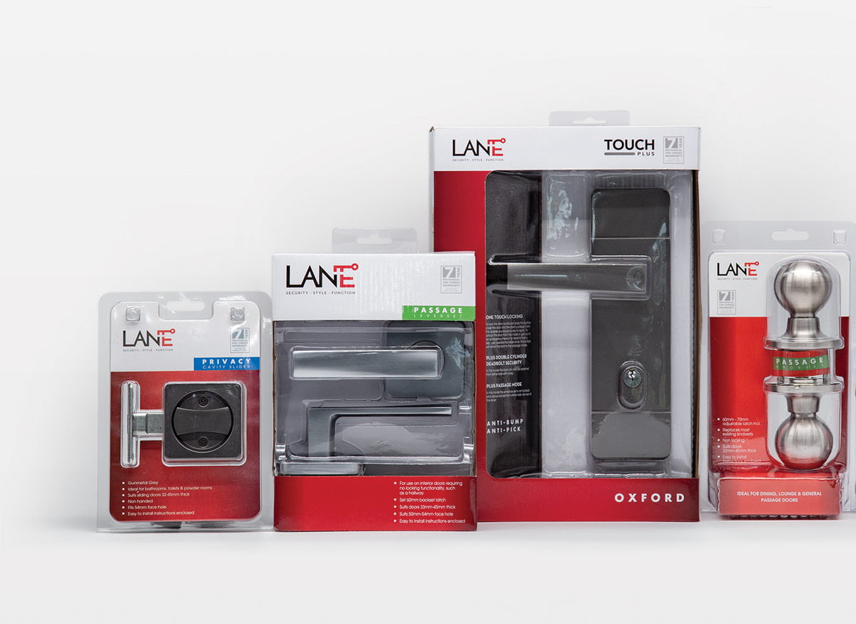
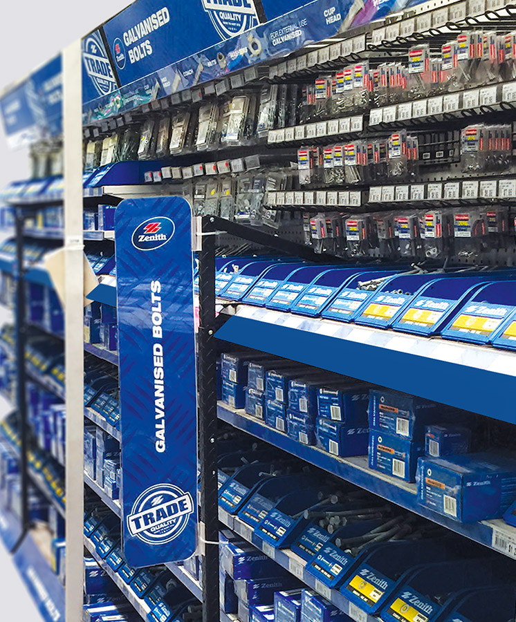
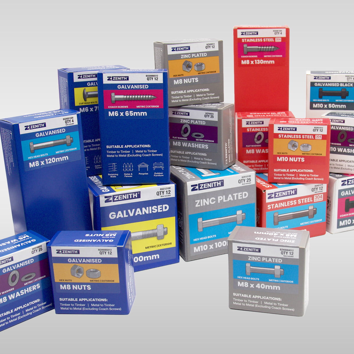
Zenith Hardware Branding and Packaging
Challenge: Maintain category leader position in hardware sector.
Solution: Packaging for an expanding range of product that makes product selection a breeze. >>
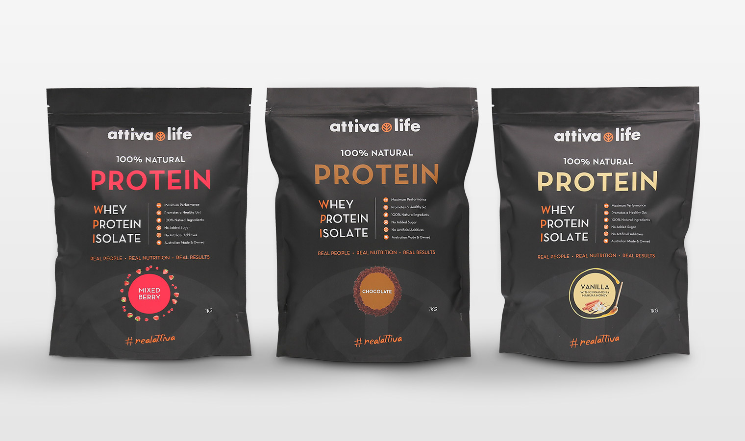
Attiva Life Protein Powder Pouches
Challenge: To create an e-commerce brand that sells a lifestyle.
Solution: A “minimalist meets natural” look that would appeal to our broad target market – not too aggressive, not too soft. >>
GT Smoke Alarms Retail Packaging
Challenge: Highlighting innovation on pack.
Solution: Practical packaging to present innovative product in the best light, enhancing both its shelf presence and consumer appeal. >>
Zenith Bolts Packaging Overhaul
Solution: Colour-coded packaging with visual cues to help DIY consumer identify products within vast range of 300 products. >>
MVR Mobile Phone Accessories Launch
Challenge: Create a brand presence in mobile phone retail stores.
Solution: An adaptable design across 10 categories with a strong colour-code system to enable navigation across range. >>
Buildex Fastener Packaging Redesign
Challenge: Rebrand over 350SKUs with minimum space and maximum impact.
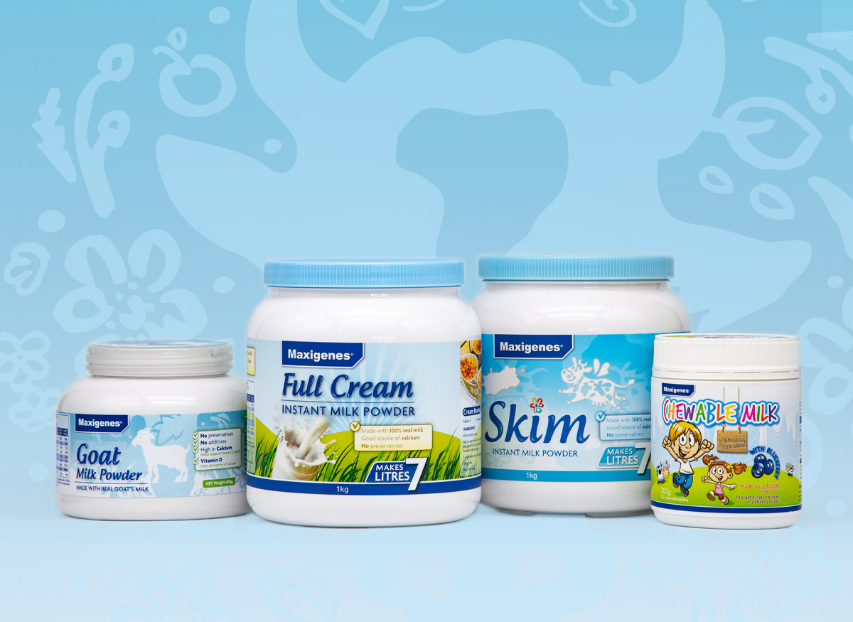
Dairy Product Range Packaging for Maxigenes
Challenge: Appealing to both local and Asian markets.
Solution: A new look for the dairy product range that could be expanded to other products including Maxigenes Chewable Milk with Blueberry. >>
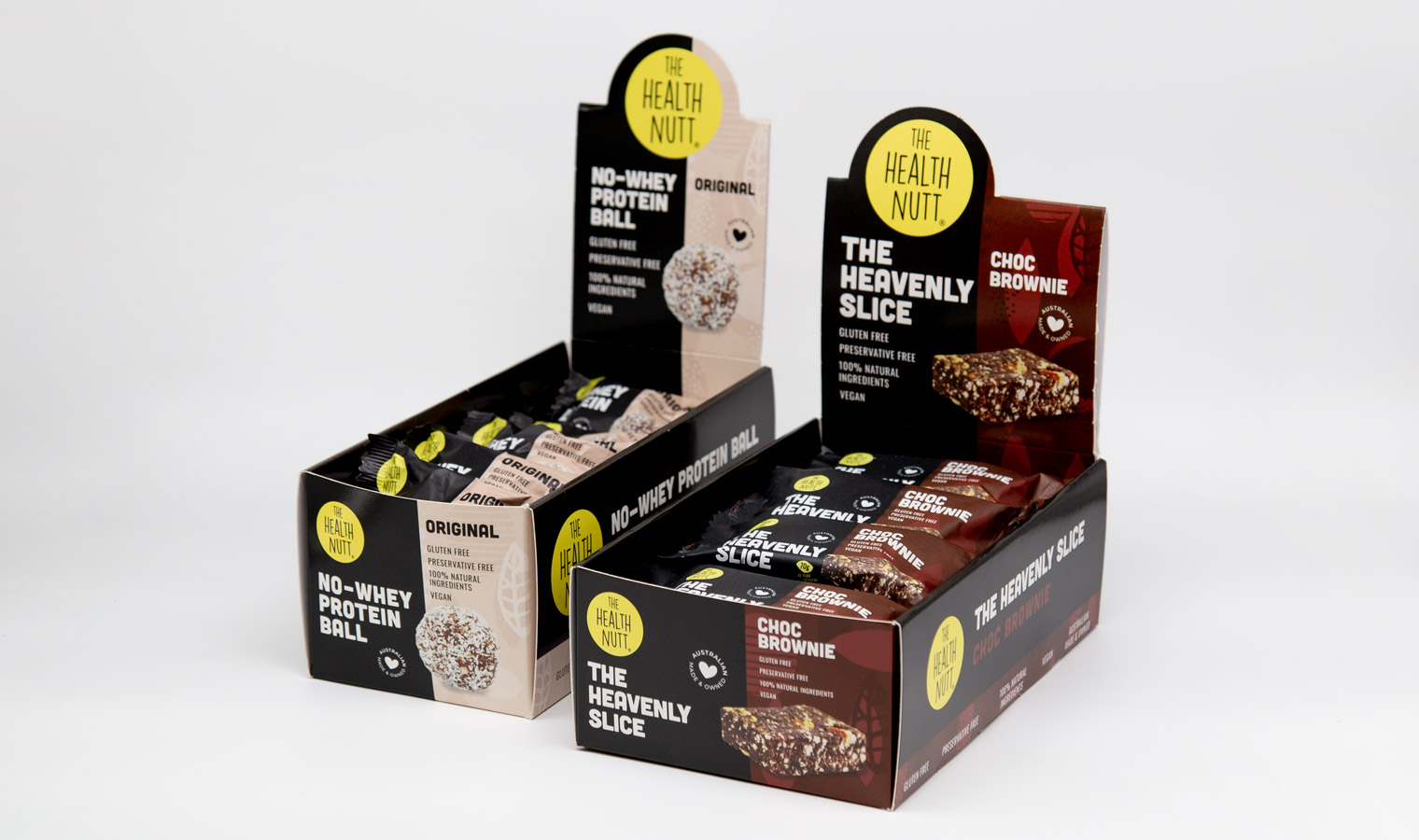
The Health Nutt Protein Balls Packaging
Solution: Striking and attention-grabbing flow packs with branded self-shipper boxes. >>
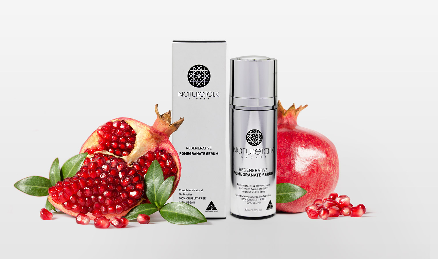
Start-Up Skincare Brand Nature Talk Packaging
Solution: A bespoke geometric “N” icon with choice of metallic stock set off the new brand. >>
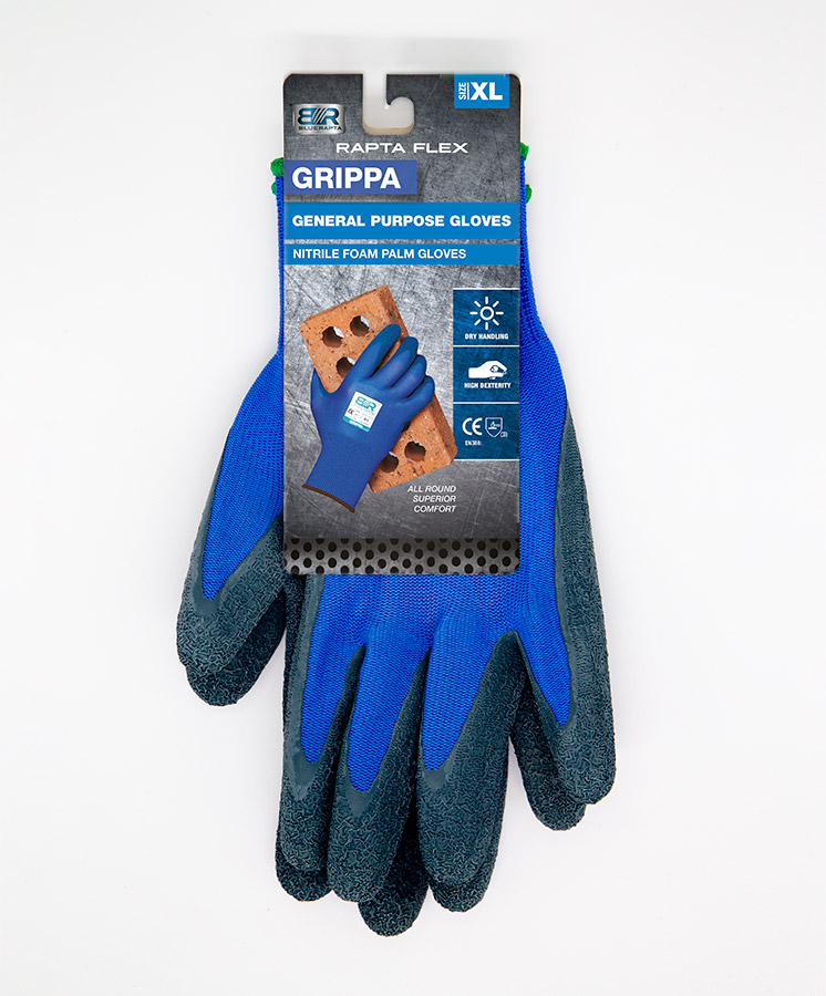
Blue Rapta Gloves Repackaging
Solution: Updated glove range design that boosted sales, made in-store merchandising easier and reduced stock wastage. >>
Are you ready to give your product wings?
If you would like 30 years of branding and packaging design expertise focussed on making sure your product gets chosen, reach out to us right now. We’d love to hear about your product, show you relevant examples and talk about how we can help your product fly off the shelf.


