
Buildex Packaging Re-Design
Category: Hardware Branding and Packaging Design
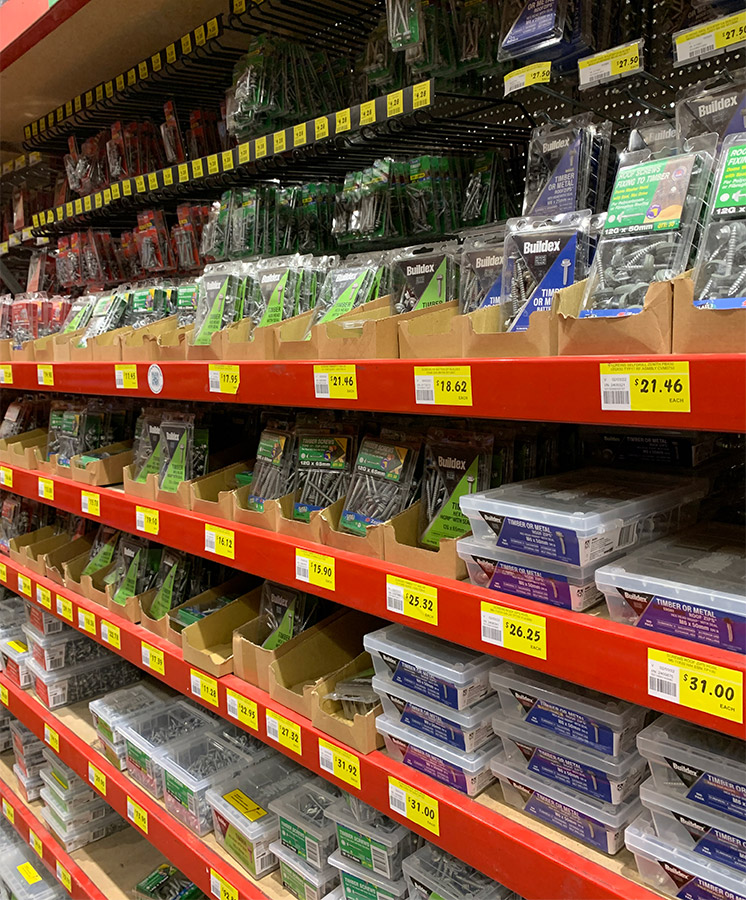
Retail packaging serves dual audiences: the shopper and the retailer. For Buildex, the new brand and labels needed to resonate with customers while reflecting the company’s trade-focused ethos, ensuring a strong, recognisable presence on the shelf.
Challenge: Minimum Space, Maximum Impact
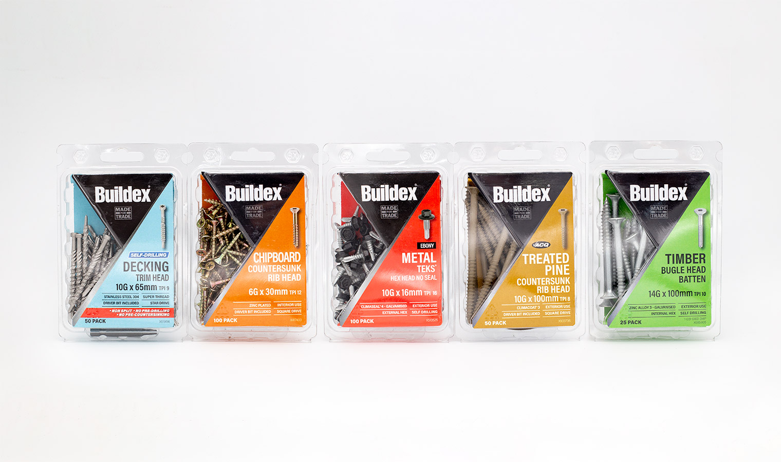
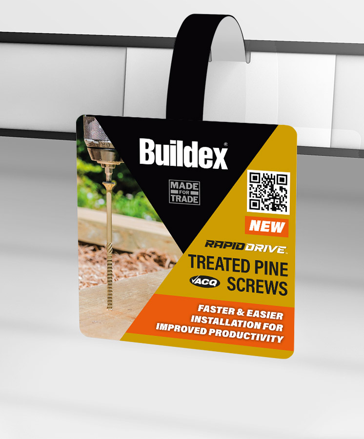
Packaging design had to project the essence of Buildex while presenting critical information clearly and intuitively. Each label packs up to sixteen essential elements from brand and category to screw specifications, features, and barcodes; arranged in a hierarchy that makes sense to the at-a-glance shopper. Colour coding further aids navigation, with red signalling metal screws – a standard we introduced two decades ago that has since been adopted across the hardware industry.
Solution: Thoughtful, Practical Design for Every SKU
Designing a label that works for every product in a large range requires careful attention to detail. Our process accounts for potential challenges, such as long product names, ensuring that every element – from the word “Countersunk” to product codes – fits comfortably without compromising the visual hierarchy. This meticulous approach results in elegant, user-friendly labels that communicate Buildex’s brand and product information effectively, even in the smallest packaging space.
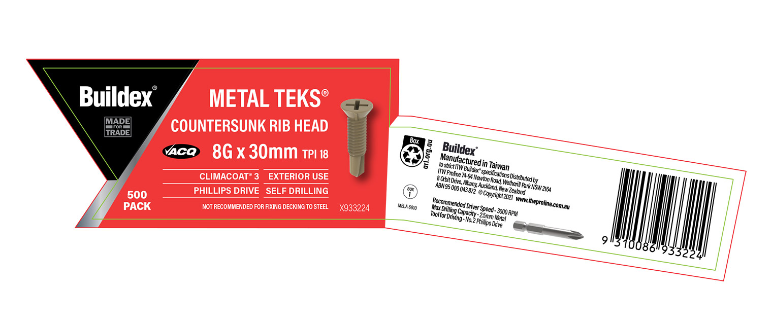
Our colour-coded system and meticulous design ensure every SKU communicates the brand clearly while fitting perfectly on the smallest label.

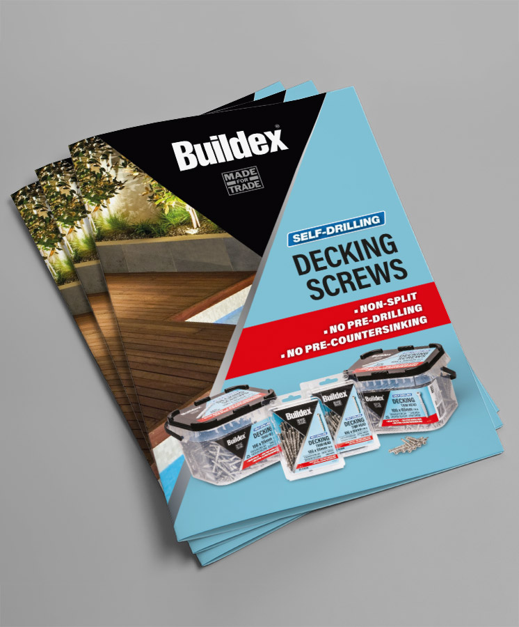
Buildex labels combine elegant simplicity with maximum information, making it easy for shoppers to find the right product at a glance.
ITW Proline has worked with Mela for more than 20 years on many projects from packaging to branding and print creative. As packaging experts, Mela have been instrumental in helping us develop innovative concepts that really set our brands apart in the market. Mela provide us with fresh, out of the box thinking and go above and beyond with their flexibility and responsiveness. I consider Mela to be an extension of our marketing team that really makes a difference to our business.”
Do you have a product that needs to jump off the shelf?
Do you have a product that needs shelf impact?
Would you like to work with specialist packaging designers who understand strategy, process, retail and shelf impact? We’d love to talk about how we can help and show you relevant examples.