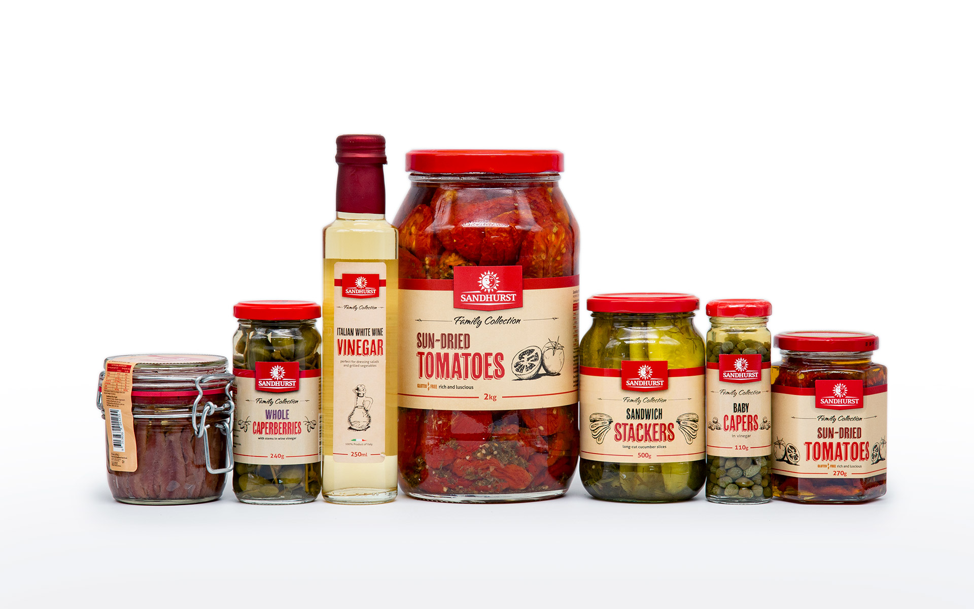
Brand and packaging design for Sandhurst Fine Foods
Category: Packaging design for food (retail and wholesale)
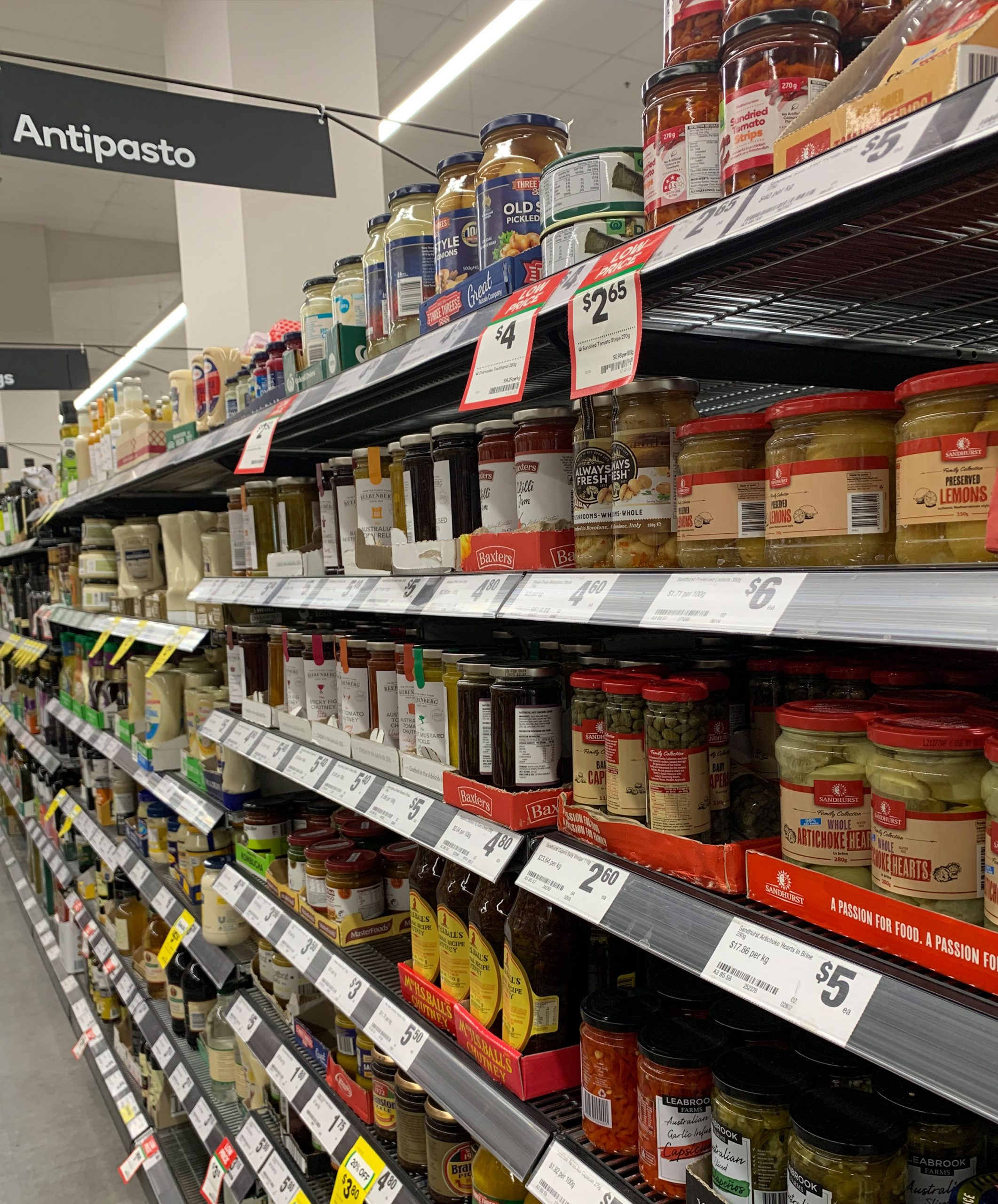
Historically, Sandhurst sold mostly to trade through its well-regarded food service lines. It did have direct-to-consumer sales through its factory outlet, but as the brand moved into supermarkets, Sandhurst wanted to rethink its shelf impact, presenting itself as an artisan producer.
Packaging to maximise return on advertising
Sandhurst invested heavily in advertising to drive customers to the shelf, but their original brand blended in with competing products. Customers would seek out the shelf, look for Sandhurst, but walk out with competing brands.
Understanding the fundamentals of packaging design
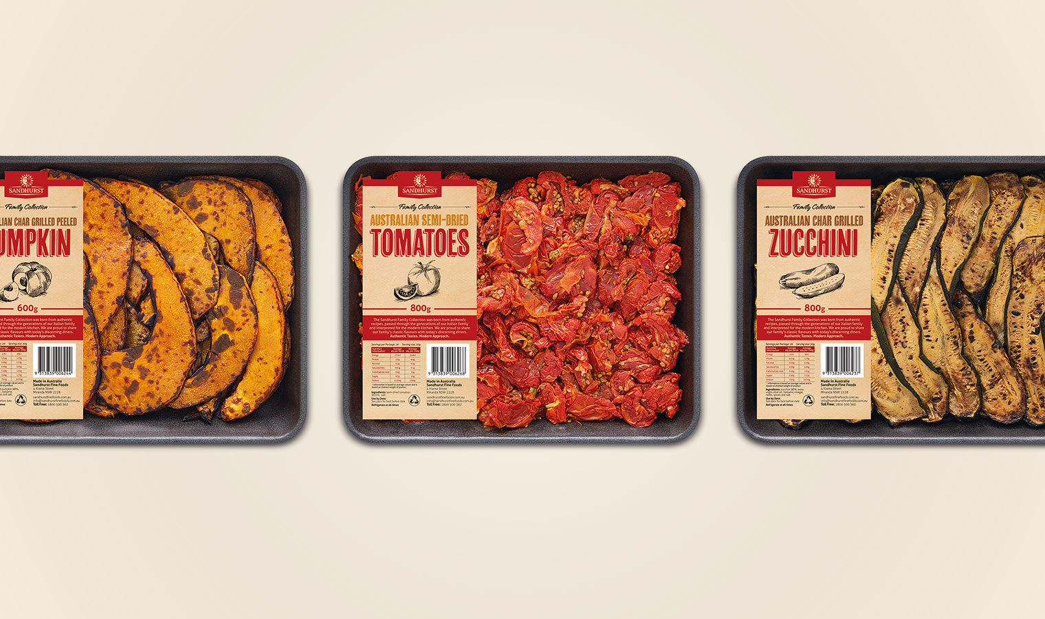
Packaging design demands an incredible amount from a small space. Colours, fonts, images and illustrations have to work harder than in any another other kind of design. At the same time, there is a red line of legalities and print considerations — step over the line and the label can’t be printed or the retailer can’t stock the product. A design that wows internally might never make it to the shelf if those legalities and print considerations aren’t incorporated in the concept. That can mean costly rework.
Packaging design that creates a code
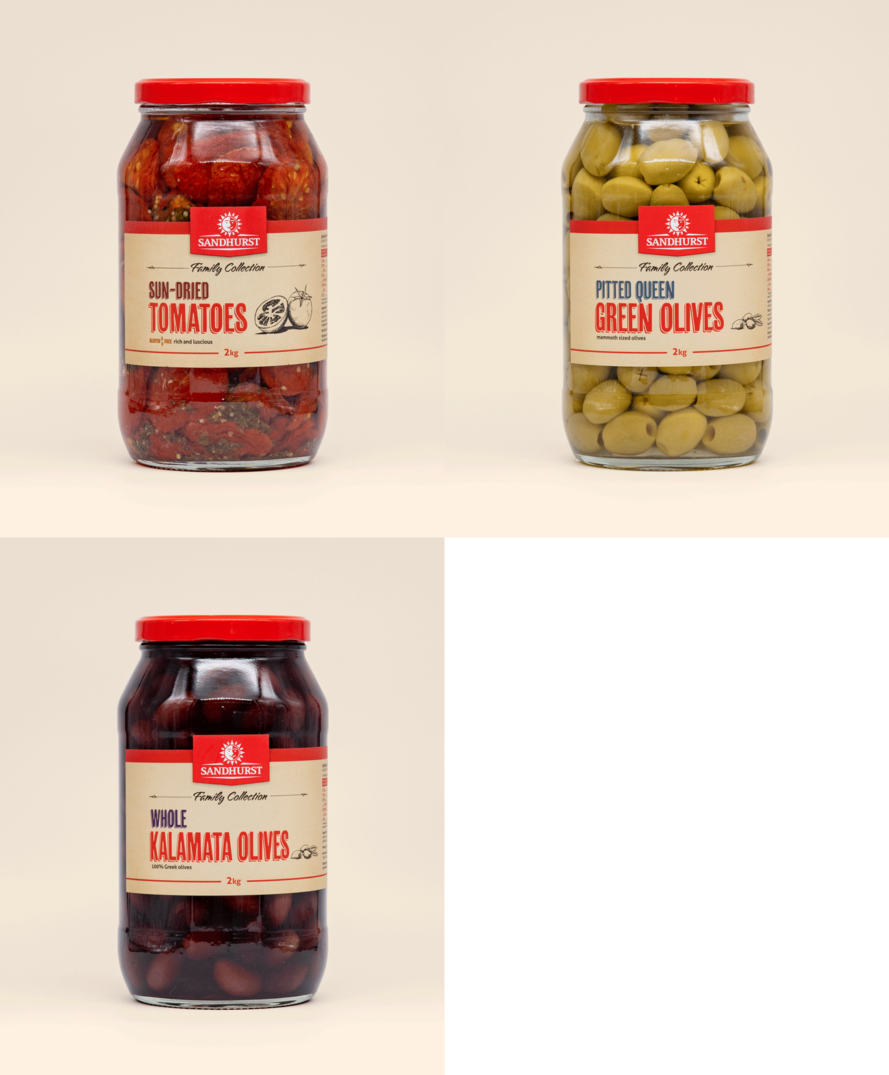
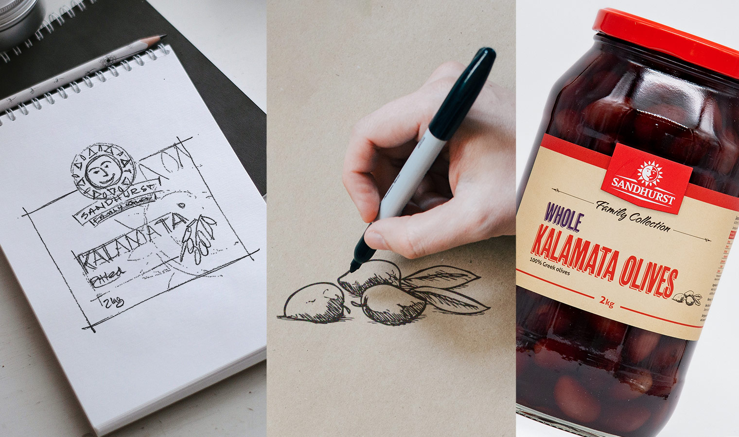
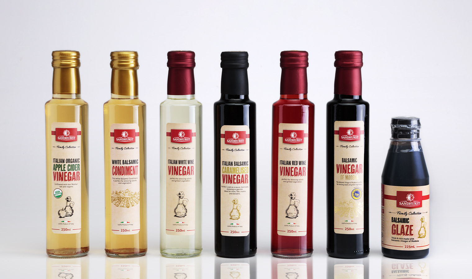
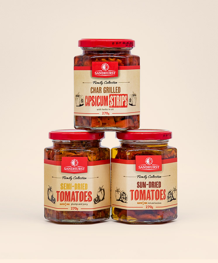
Our designers specially commissioned hand-drawn illustrations of ingredients to convey Sandhurst’s dedication to quality produce. However, a single design element can do only so much work — it’s hard to illustrate the difference between a sun-dried tomato and a semi-dried tomato. Colour cues in Sandhurst’s new labels are an additional orientation to the product, making sure the customer always go home with the right jar.
Presenting the packaging options to the CEO and the consumer
We presented the CEO with different design concepts, each one moving the brand further away from where it sat at the time. There was resistance to our preferred concept, the one that was furthest from the baseline. However, an on-shelf demonstration swung the vote…
Standing in a supermarket, the CEO watched customers walk down the aisle and reach out time and again for the mock-up of our preferred concept. Reaching for our design, consumers passed over not only competitors, but also Sandhurst products in their then-current livery. Introducing himself to customers afterwards, the CEO found out that many of these customers were shopping for their usual brand but had been drawn to try Sandhurst by the new livery in our concept.


Sandhurst embarked on a major redesign of branding and logo with Mela Creative. We relied on their team to deliver logo and packaging designs and we were extremely pleased with the attention to detail and their consideration of our packaging constraints. The communication has been excellent and they really understand our business.”

Do you have a product that needs to jump off the shelf?
Do you have a product that needs shelf impact?
Would you like to work with specialist packaging designers who understand strategy, process, retail and shelf impact? We’d love to talk about how we can help and show you relevant examples.

