Hermetica Branding and Packaging
Category: Alcoholic Beverage Packaging
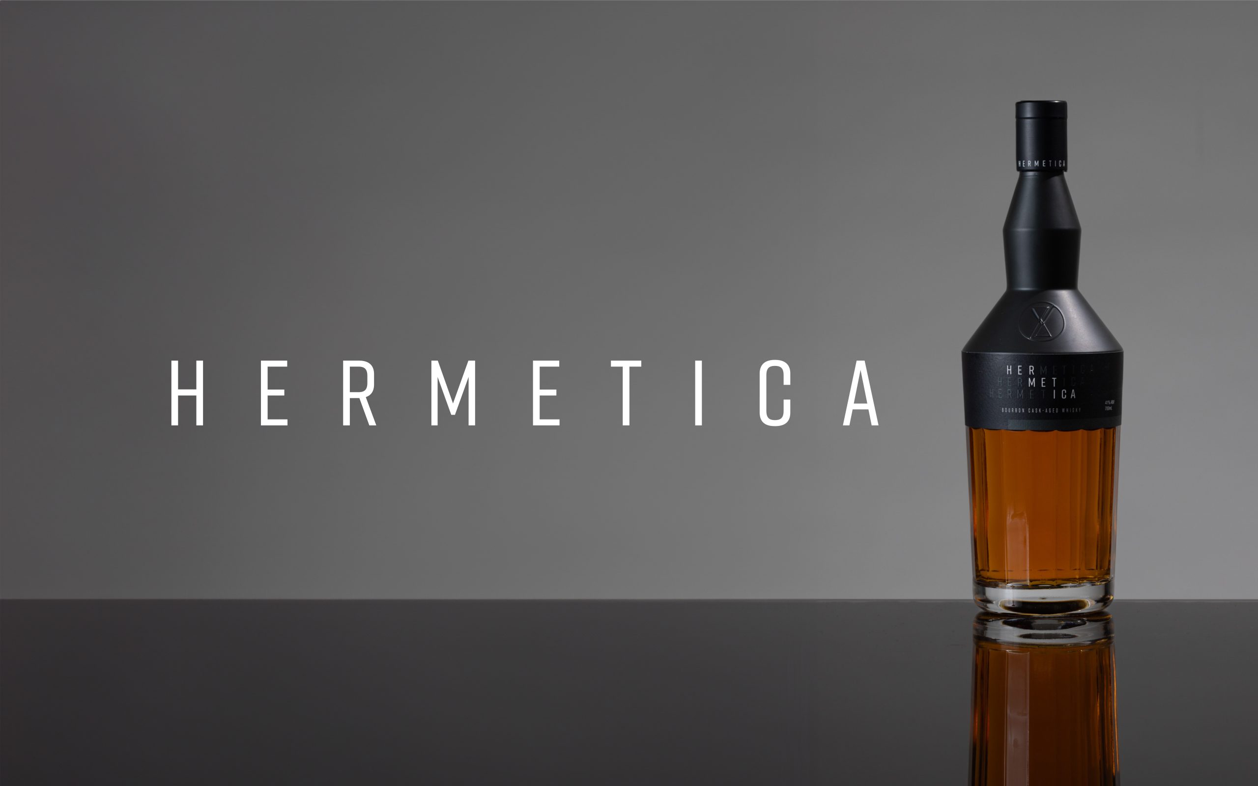
Hermetica is a brand of alcoholic beverages distilleded in the Yarra Valley region of Victoria. The Hermetica story is about a passion for capturing the essence of life’s experiences and moments in every bottle created. The name draws inspiration from the Hermetic principles of alchemy, emphasising transformation, purity and the melding of art with science.
Challenge: Branding with Meaning
We created branding for this new brand of premium spirits inspired from elements of the theories of Hermes Trismegistus, the founder of Hermeticism. Hermeticism is associated with antiquity, wisdom and the interconnection between humans, the cosmos and the divine.
“As above, so below. As within, so without.” – Hermes Trismegistus
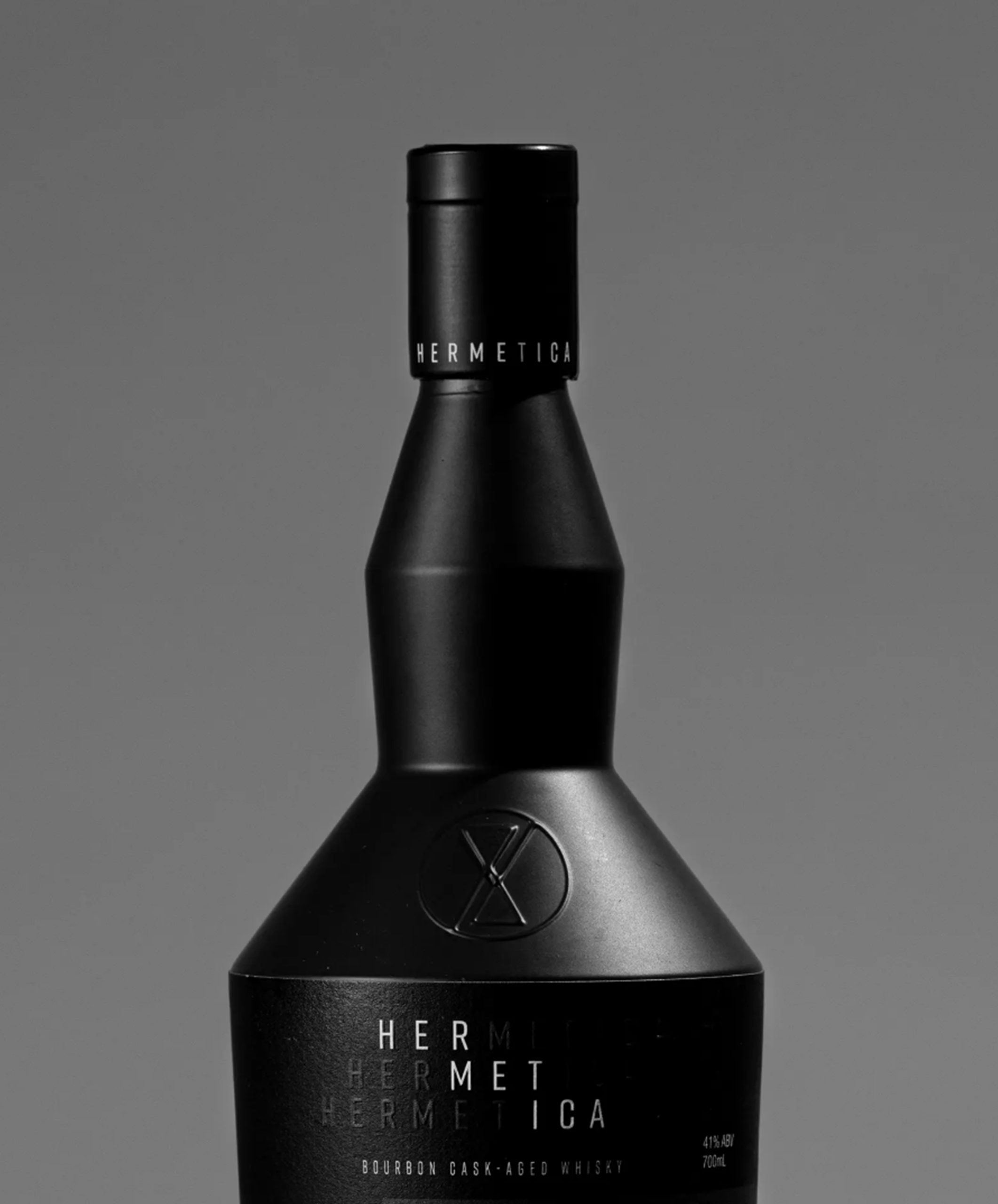
The geometric logo and icon we designed infuses three hermetic ideas:
• as above, is below symmetry
• the alchemical symbol for water (downward-pointing triangle)
• the hourglass to symbolise time
Solution: Timeless Packaging Design
We designed the bottle label to be elegant, typographic and reinforcing the idea of ‘as above, is below’ in the repeated stacked logo. The brand is designed to appeal to a wider target audience than the older male traditional whisky-drinkers, with a clean and modern look and feel.
Photography courtesy of https://hermeticadistillery.com/


The range includes triple gold medalist Bourbon Cask-aged Whisky, Australian Red Wine Cask-aged Whisky, Pine Needle Gin, Pristine Reflux-distilled Vodka and Rum that have our distinct colour-coding on both labels and the unique bottles. Additional small batch White Agave, Repasado Agave, Sloe-Gin and liqueur use a single white colour-code.


Do you have a product that needs to jump off the shelf?
Do you have a product that needs shelf impact?
Would you like to work with specialist packaging designers who understand strategy, process, retail and shelf impact? We’d love to talk about how we can help and show you relevant examples.

