Colour creates expectation
Colour is very powerful in creating expectation. The persuasive power of colour is very important in branding!
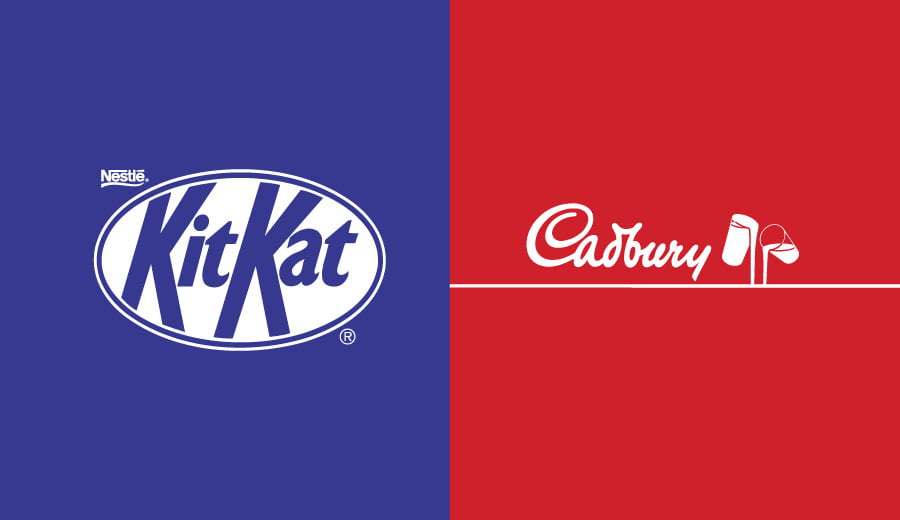
We have played around with the brand colours of two very iconic chocolate brands to see what effect this has on perception.
Does KitKat’s “have a break” lose its sense of urgency when it’s not red?
What about Cadbury’s rich indulgence? Still feeling it with red? Probably not as much as with purple and gold.
It is very important to choose the right branding colours for your business because it creates an expectation for a brand. The consistent use of strong brand colour builds trust and familiarity. If this is taken away or changed customers will be confused and disconnected.
We are hardwired to subconsciously react to particular colour in a specific way. This comes from years of conditioning from the time we are born and is specific to different cultures. That’s why many brands use similar colour palettes. On average, a company will use only 1 or 2 brand colours.
A study of the world’s top 100 brands (by brand value) showed that the most popular logo colour is blue, followed by red and black.
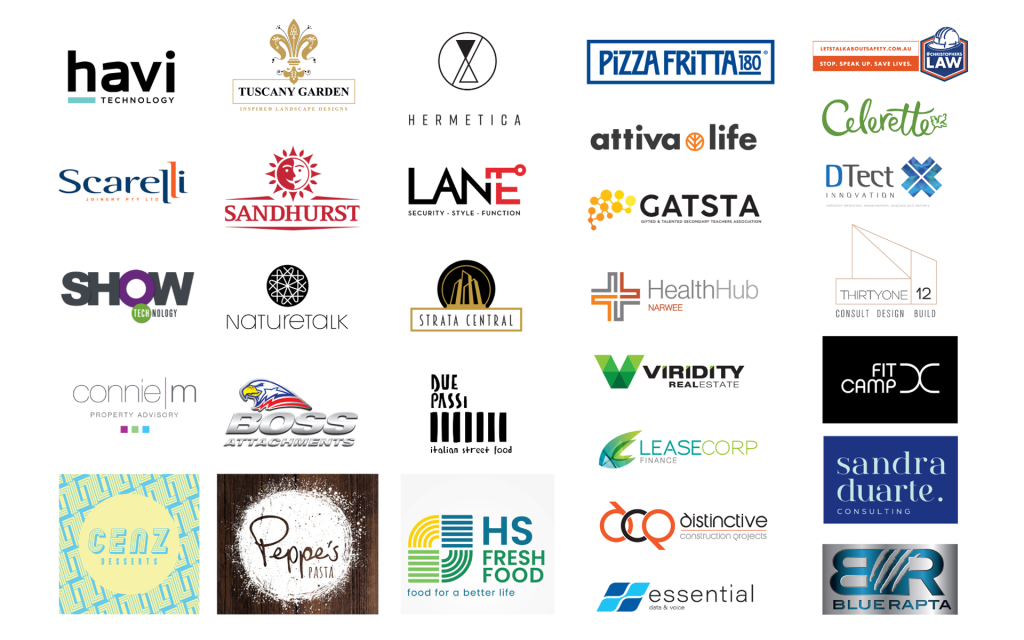
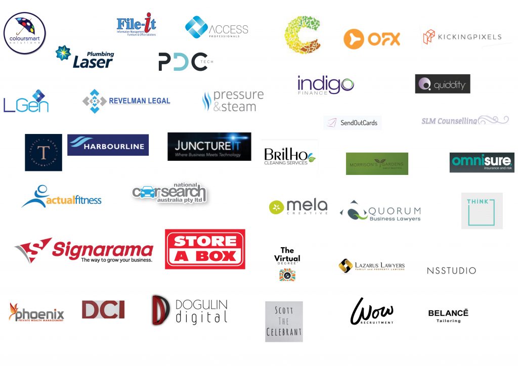
This theory was backed by our own study of the logo colours of a group of 38 businesses in a Sydney networking group.
 Independent Study Results on Brand Colours
Most of the group used 2 logo colours – with the most common colour, used by 37% of the businesses, being blue.
Why is it so popular? Blue is a cool colour often associated with trust and stability. It is a safe colour. Dark blue brings security, professionalism and formality. Light blue is more calming and lends itself to tranquility, trust and openness.
Red was the next most common colour representing 13% of logos. Red is energetic and attention-grabbing, showing excitement, strength and power. Neck on neck with red was black. Black is associated with prestige and power as well as glamour, luxury and elegance.
Green tones (11% of logos) are associated with freshness, harmony and growth. Turquoise logos (5%) symbolise wisdom, serenity and loyalty.
A further 11% of logos were in the purple to mauve colour bracket. Purple represents quality, truthfulness and sophistication. Lastly, orange is playful, enthusiastic, happy, friendly and connected and is used by 8% of the group.
Colour Should Fit Brand Personality
Colours are most effective when consumers believe that the brand’s colour “fits” the brand. Colour should align with a brand’s personality rather than aim for a certain preconceived expectation based on your industry. There is no right or wrong, but strong use of colour plays a very important role in branding. Using the persuasive power of colour is useful in creating an accurate perception about your business.

