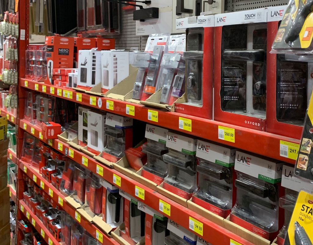
Mela Creative has been working closely with the team at ITW Proline for over 2 years on the new packaging of Lane that will be rolled into stores across Australia from September 2019.
We developed a design strategy for the creation of ‘look & feel’ conceptual designs. This included market and competitor research to ensure packs will differentiate from and lead rather than follow.
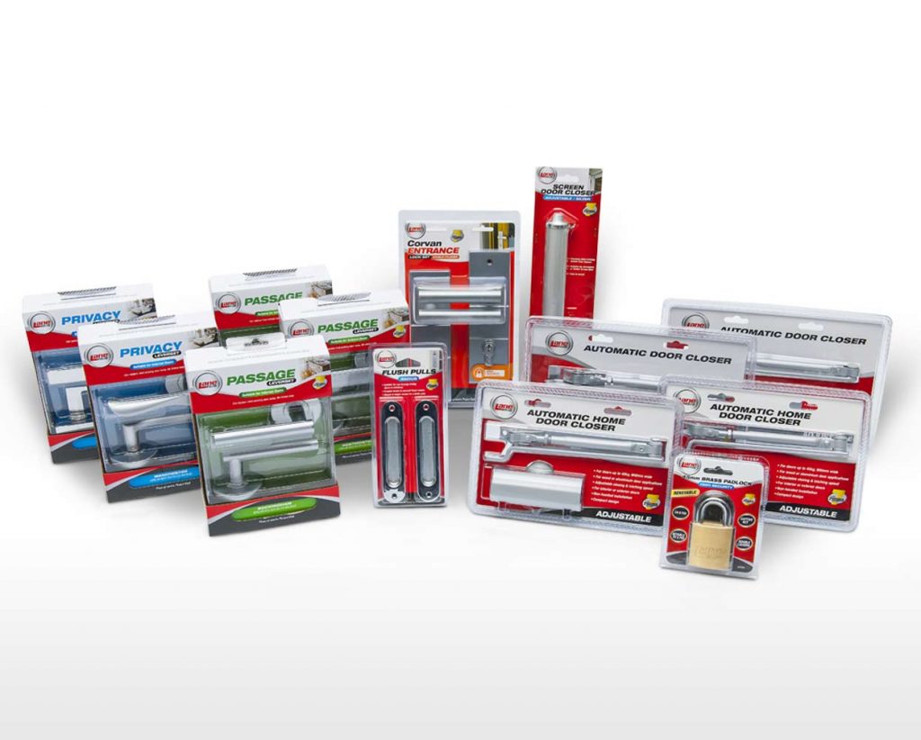
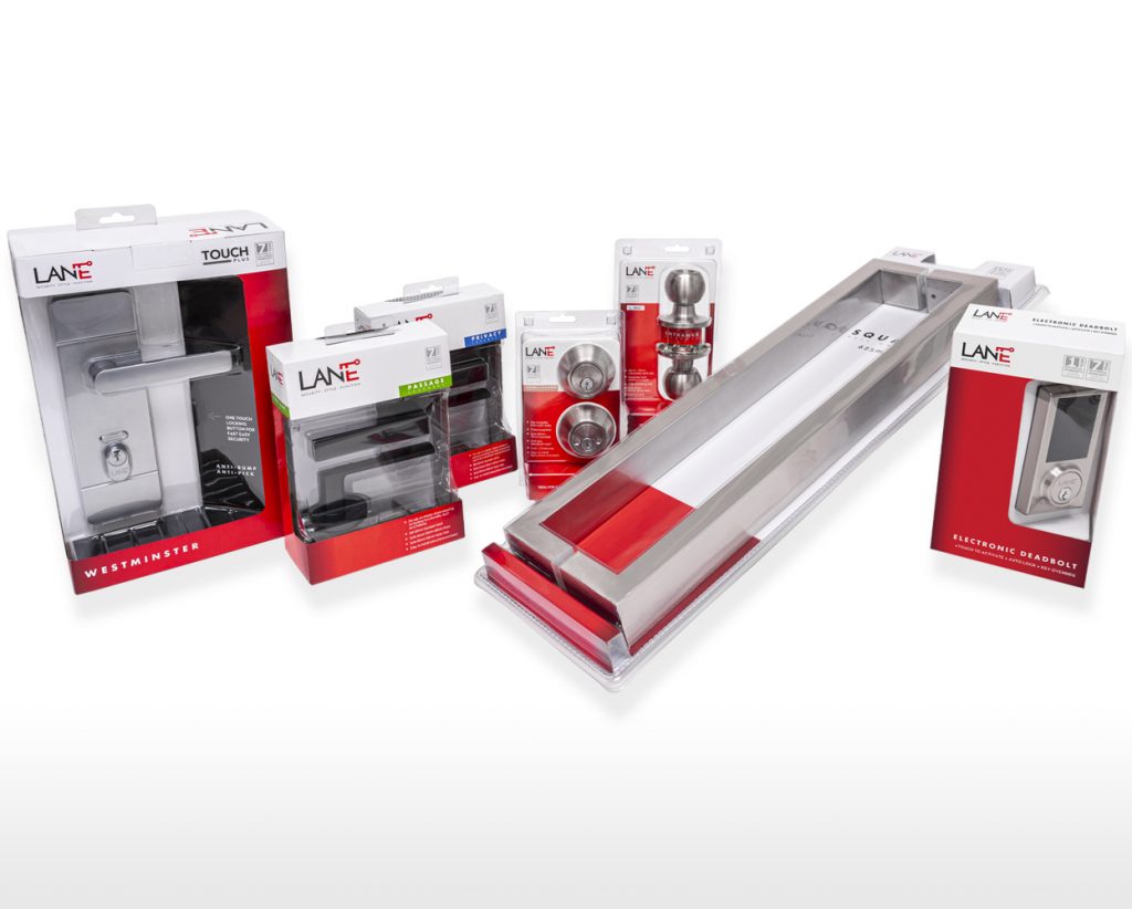
Lane has been associated with the colour red for decades so we felt it was important to maintain this recognisable branding element. The Lane red used on packaging was updated from a flat colour to a gradient background along with a contrasting white masthead to give the packaging a more premium look.
We developed the tagline SECURITY – STYLE – FUNCTION that is derived from keywords that cover the core offerings of Lane and follows on from the original brand name Lane Security whilst being consistent with the strong, bold Lane branding.
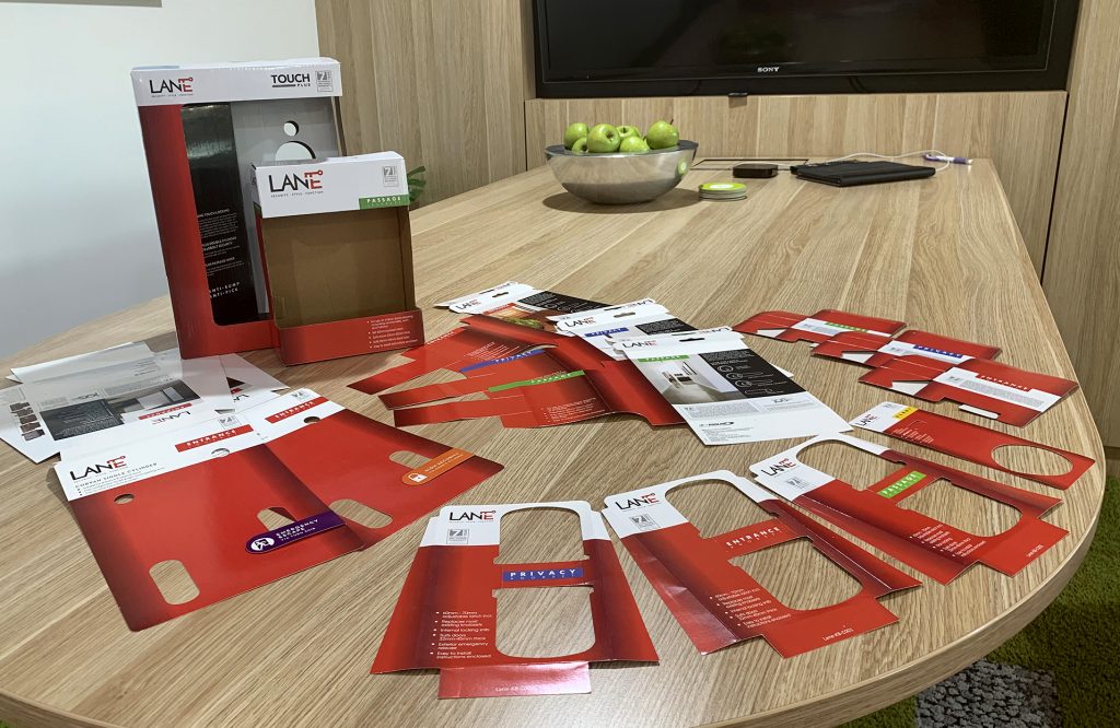
Along the way, many digital and printed mock-ups were created for the brand manager to present internally and externally at each stage of the project. These were used by a focus group as well as for presentation to hardware buyers for approval.
Final artwork for Lane Lever blister boxes, Lane Entrance Set boxes, Lane Pull Handles boxes, Lane Knob blister packs, Lane Bulk Hinge boxes, Lane Hinge poly bags and Lane Accessories card packs were sent to ITW Proline’s suppliers to create prototypes before going to full-scale print production.
The new range makes an impressive statement with an unmistakable, distinctive Lane brand look.
Read more here.