The psychology of colour in branding
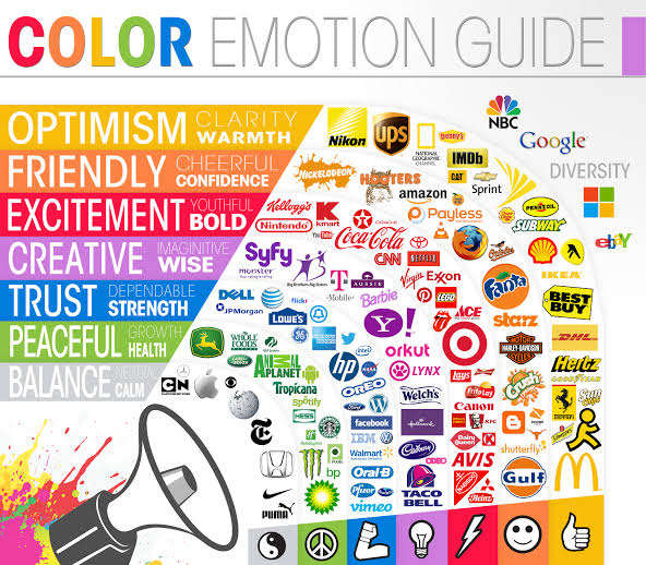
Choosing a brand colour should not be a personal preference but rather a strategic choice to elicit a desired response. As shown in the chart below, different brand colours are associated with different feelings:
- Yellow is optimistic
- Orange is friendly
- Red is exciting
- Purple is creative
- Blue is trustworthy
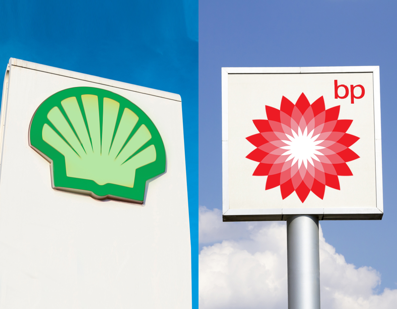
- Green is peaceful
- Grey is calming
Brands can use this knowledge to their advantage in order to set the mood for the experience we can expect from the brand.
The number one brand colour is blue
A study of the world’s top 100 brands (by brand value) showed that the most popular logo colour is blue.
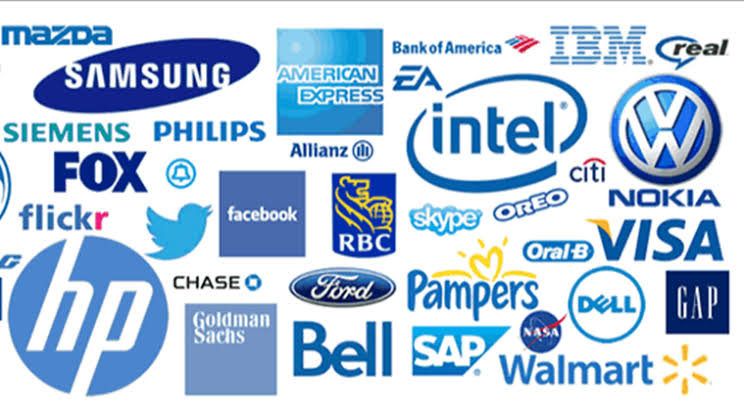
Why is it so popular? Blue is a cool colour often associated with trust and stability. It is a safe colour. Dark blue brings security, professionalism and formality whereas light blue is more calming and lends itself to tranquility, trust and openness.
The number two brand colour is red

Red, the next most common colour is energetic and attention-grabbing, showing excitement, strength and power.
The number three brand colour is black
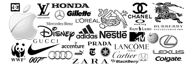
Black, a close next to red is associated with prestige and power as well as glamour, luxury and elegance.
Other brand colours
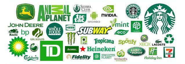
Green tones evoke feelings of freshness, harmony and growth through to wisdom, serenity and loyalty when approaching turquoise.
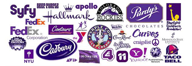
Purple represents quality, truthfulness and sophistication and also serenity at the lighter end of the spectrum.
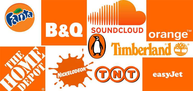
Lastly, orange is playful, enthusiastic, happy, friendly and connected.
Brand colour should fit personality
Colours are most effective when consumers believe that the brand’s colour “fits” the brand. Colour should align with a brand’s personality rather than aim for a certain preconceived expectation based on your industry. There is no right or wrong, but strong use of colour plays a very important role in brand awareness and credibility.
Does your brand need a colour refresh or are you looking to develop a new brand?
Speak to the brand colour professionals at Mela Creative today.


