
Introduction
Rebranding is more than a visual makeover; it’s a strategic evolution that aligns a business with its current goals, audience and market position. It requires a clear vision, thoughtful design, and seamless execution to ensure the transformation resonates with both internal teams and external audiences. At Mela Creative, we’ve partnered with diverse clients to navigate the complexities of rebranding, ensuring their transformations reflect not just who they are—but who they aspire to become.
Here are some standout success stories from our portfolio:
1. Fit Camp X: Broadening Horizons
Originally known as Fit Camp Transformation Centre, this fitness brand sought to expand beyond its boot camp roots. The rebrand to “Fit Camp X” signified a shift towards a more inclusive fitness offering, encompassing group classes and personal training. We developed a minimalist logo and monochrome imagery to appeal to a broader demographic, effectively repositioning the brand in the competitive fitness market.
Read more »

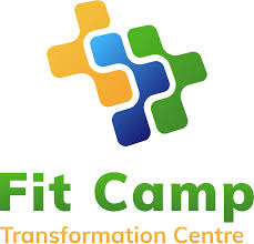
old logo
new logo
2. Lane: Reinforcing Market Leadership
Lane, a longstanding client, recognized the need to refresh its brand to maintain its position in the hardware industry. We embarked on a comprehensive rebrand, starting with a new logo and extending across packaging and communication materials. By consolidating three hardware brands into one cohesive identity and redesigning 294 package designs over 12 months, Lane successfully reinforced its market leadership and prepared for future expansions.
Read more »


old logo

new logo
3. Blue Rapta: Embodying Strength and Performance
Blue Rapta, a PPE brand under RSEA Safety, needed a brand identity that matched the robustness of its products. We introduced a dynamic logo featuring a metallic finish and claw mark, symbolizing strength and agility. The packaging redesign improved product visibility and selection, leading to increased sales and reduced stock wastage.
Read more »

 old pack
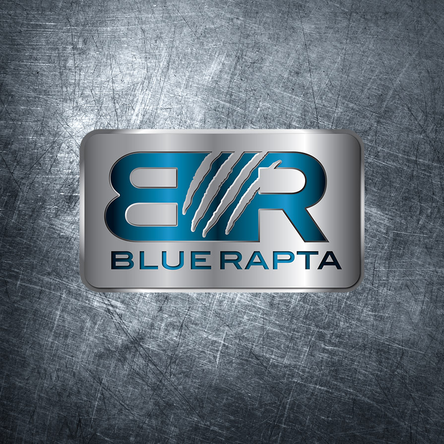
new logo
4. Carers NSW: Aligning with National Identity
Following a major rebrand by Carers Australia, Carers NSW needed to realign its corporate identity with national brand guidelines. We collaborated with their communications team to update marketing materials, including annual reports, brochures, and infographics. Our work ensured consistency across various departments while adhering to tight budgets and strict guidelines.
Read more »

 old logo

new infographics to brand guidelines
5. Show Technology: Lighting the Way to a Modern Identity
As one of Australia’s leading suppliers of professional lighting systems, Show Technology wanted a brand identity that reflected its innovation, reliability, and industry leadership. Mela Creative refreshed the logo with a bold, modern design that captured the essence of light and motion. The new branding was rolled out across signage, stationery, and digital platforms, helping Show Technology present a consistent and contemporary face to clients and industry partners alike.
Read more »

![]()
Final Thoughts
These case studies illustrate the multifaceted nature of rebranding and its potential to drive business growth and market relevance. If you’re considering a rebrand, Mela Creative offers the expertise to guide you through a strategic and impactful transformation.
Interested in revitalizing your brand?
Contact us to explore how we can help.


