
Blue Rapta Re-Brand
Category: Safety Wear Branding and Packaging
Blue Rapta, a personal protective equipment (PPE) brand distributed by RSEA Safety, sought to evolve its brand identity and packaging to better communicate strength, reliability, and high performance. Mela Creative was engaged to create a bold and cohesive visual identity that would resonate with industrial users and enhance the brand’s presence in-store.
Challenge: Rebranding for Impact and Functionality
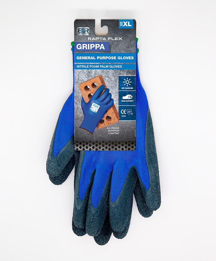
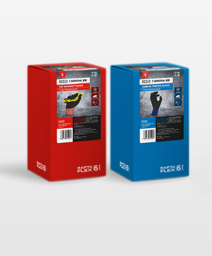
The existing Blue Rapta branding was dated and lacked visual strength, while some product packaging, such as the Rapta Flex glove range in plastic bags, was underperforming in stores. The challenge was to redesign the logo and packaging to reflect the industrial quality of the products, improve merchandising, and make product selection easy for customers.
Solution: Powerful Branding and Practical Packaging
Mela Creative developed a new metallic, three-dimensional logo featuring a claw mark to reference the strength of the bird of prey behind the brand name. Packaging for respiratory masks and the glove range was redesigned for clear identification and point-of-sale impact, with hang-sell and bulk pack formats that improved visibility and merchandising. The refreshed packaging led to increased sales, reduced stock wastage, and a stronger in-store presence for Blue Rapta products.

Redesigned packaging boosted sales, reduced stock wastage, and made in-store merchandising effortless.
Do you have a product that needs to jump off the shelf?
Do you have a product that needs shelf impact?
Would you like to work with specialist packaging designers who understand strategy, process, retail and shelf impact? We’d love to talk about how we can help and show you relevant examples.