Fit Camp X Branding
Category: Gym Branding
Fit Camp X is the evolution of the locally loved Fit Camp Transformation Centre in north-west Sydney. Under new ownership, the gym sought a brand refresh that would reflect the owner’s vision to expand its fitness offerings and appeal to a broader audience.
Challenge: Expanding the Brand While Maintaining Recognition
The original name, Fit Camp Transformation Centre, was strongly associated with a 7-week weight-loss program, giving the impression that the gym only offered boot camp classes. The challenge was to create a name and visual identity that maintained existing local recognition and search ranking, while signalling a wider range of programs for diverse demographics.
Solution: A Memorable Name and Gender-Neutral Brand Identity
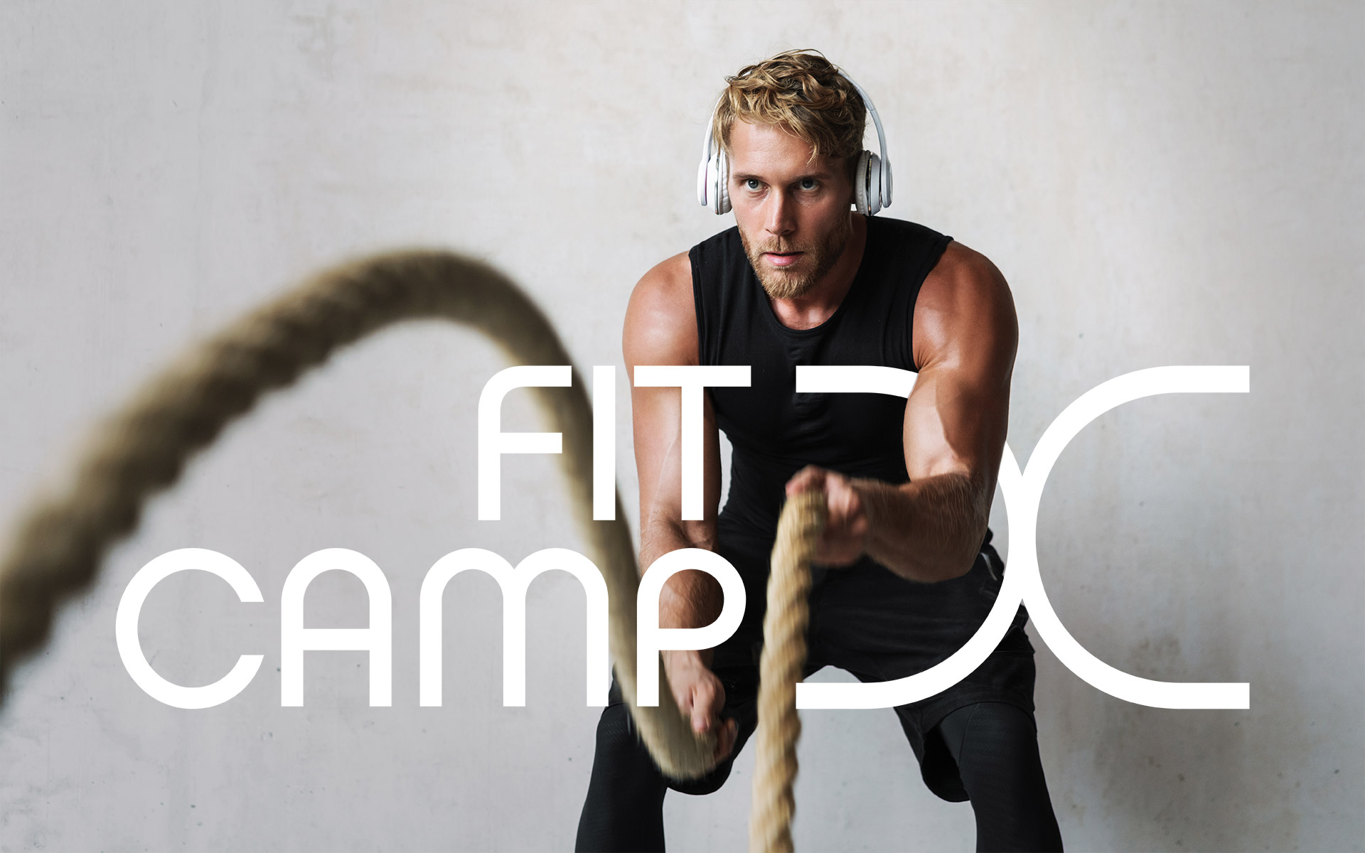
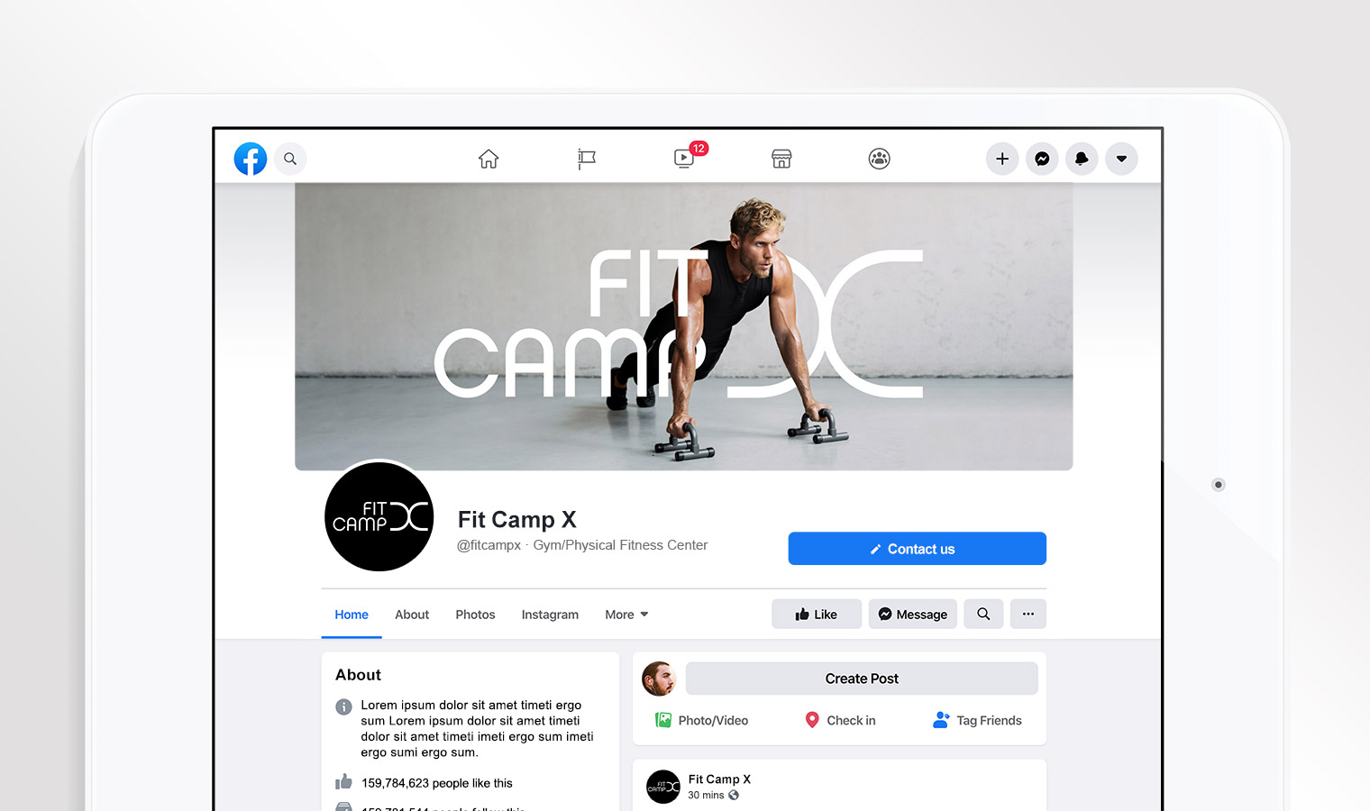
We worked with the new owners to select the name Fit Camp X, implying extra, extreme, or extension, while keeping it short, memorable, and familiar to the community. The brand identity features a minimalist, contemporary design with a curved, flowing logo and a stylised ‘X’, complemented by soft, natural grey tones in imagery and a black-and-white logo palette. This cohesive branding positions Fit Camp X as a welcoming, high-end fitness space for all types of people, extending beyond boot camp to encompass the full range of the gym’s offerings.
Fit Camp X’s minimalist, gender-neutral branding and stylised ‘X’ signal growth and inclusivity, positioning the gym as a welcoming space for all fitness levels.
Do you have a product that needs to jump off the shelf?
Do you have a product that needs shelf impact?
Would you like to work with specialist packaging designers who understand strategy, process, retail and shelf impact? We’d love to talk about how we can help and show you relevant examples.