Consistent branding helps you to create brand recognition, give your business credibility and build trust with customers. On the contrary, inconsistent branding could be costing you money. According to an industry benchmark report from the US, inconsistent branding creates confusion in the market, damages credibility and makes it harder to compete. Furthermore, the same respondents attributed an average revenue increase of 23% to brand consistency.
It takes time and repetition to be remembered. In fact, up to 7 times! This is how often people need to see your logo before they will actually remember it. Give your customers a great first impression, so they can start to remember your brand and are left with a lasting impression by the time they have interacted with your brand 5 times:
- business card
- website
- social media
- visit premises
Getting that first sale will be so much easier when new customers start to feel they could trust you, even before you’ve met.
Here are our 5 tips you can take home to start making your branding consistent:
1. A great logo
If you don’t have a professional logo, invest in one. A well-designed logo will stay with your business for years so should represent your brand personality in a unique way. Avoid using stock standard typical icons such as scissors for a hairdresser, a house for a real estate business. These are typical, seen everywhere and not very memorable.
Make sure you have the correct logo in all formats readily available, don’t rely on using what you can re-download from the website. And never ever distort a logo to fit into space.
Know how your icon or device should be used alone or with your name and keep a reference for any pattern, shapes or textures used in association with your logo. This forms an important part of your branding because branding is not just a logo.
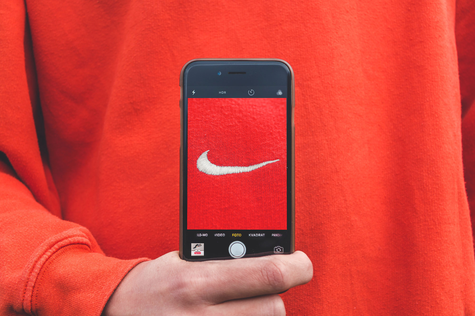
Did you know that the globally recognised Nike logo was thought to be inspired by an ancient stone carving in Ephesus. Look at the folds in the garment of Nike, the goddess of victory.

Even without global recognition, we can all strive for consistent branding so we make it easier for people to recognise our business when they see it.
2. A standardised colour palette
Colour is the first thing we remember about a brand. In fact, colour increases brand recognition by up to 80 percent*. Colours are most effective when consumers believe that the brand’s colour “fits” the brand. Use the persuasive power of colour to create an accurate perception about your business.
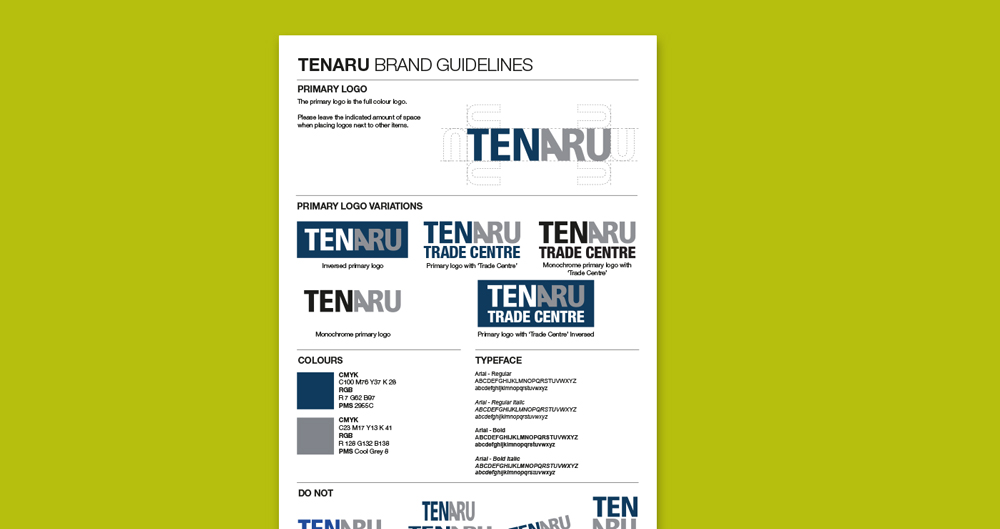
You should know your exact brand colours – in PMS, CMYK and RGB. With brand colours, less is more – don’t introduce too many colours into your branding. It can cause confusion.
AAMI’s use of red consistently ties all marketing back to its brand identity. The familiarity of the colour helps to give the brand credibility.

Do people feel a sense of familiarity with the way your branding is presented online and offline?
3. Uniform typography
In the digital world, using standard fonts and typefaces that are universally available for web makes life so much easier. There is nothing consistent about a brochure using a completely different font to an email blast. Know the name of your brand’s font, including all the variants and the styles used eg headings, body copy, callouts – and use it, always.
The best way to keep track of your branding elements including font and colour, is to have a brand style guide or brand guideline document set up by your graphic designer. It doesn’t have to be extensive, just a handy reference with all your assets so you can give this to anyone working on your marketing and advertising. This will keep everything consistent.

4. An image style
Free stock library imagery is so readily available now and although a very useful tool, chances are you are not the only one that liked and used a particular image.
If possible, create a photographic library of your own imagery of say staff, the office or store, staff working in different environments, events etc that you know are original and definitely won’t be plastered all over the internet. Have a centralised image library where on-brand images or graphics are stored for future use on company collateral. This will give your brand a unique and memorable look.
5. Tone of Voice
How do you want to sound to customers? Fun? Business-like? Casual? Calm? Tech-savvy? You need to keep a unified voice across all marketing to maintain the personality of your brand. Messaging and the phrases you use should complement the visuals and vice versa!
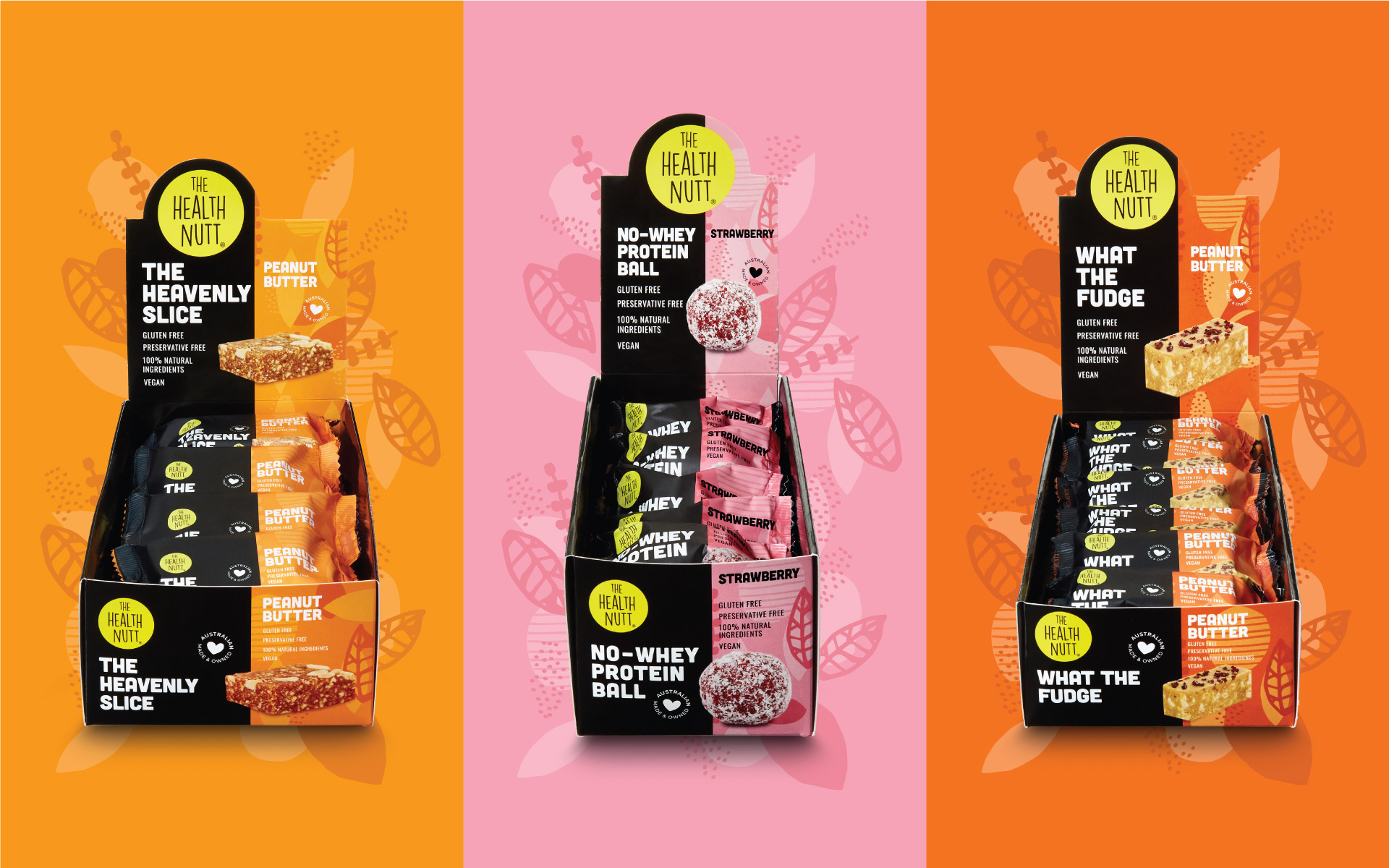
The Health Nutt is cheeky and witty, so product names and messaging adopt this tone of voice.
Conclusion
A strong, recognisable brand that customers trust helps ensure future business, builds the value of your brand and, ultimately, your financial return.
Keep a downloadable version of these tips handy: Download now
Need a hand with making your branding consistent?
Our creative team lives and breathes branding and can help you align all your branding. Contact us now.
*Source: University of Loyola, Maryland study.


